Dynamic UI for ManageIQ Provider Operations
August 16, 2018 - Words by Miha Pleško - 5 min read

Having read our blogpost about Implementing ManageIQ Provider Operations with Ansible one might be wondering about how to capture Ansible playbook inputs from user. Isn’t it difficult to provide a custom native UI form in ManageIQ that would capture user inputs like subnet name, address and netmask?
Well, it used to be a big pain to implement any dynamic and fully-customized HTML form for a ManageIQ provider. But not anymore. Just a few days ago the ManageIQ UI team introduced support for React Components that live in a provider codebase.
We immediately fell in love. So much that we simply had to share the story with you, fellow developers.
UI Code Centralization Issue
Nuage Networks
asked us to help them integrate their software-defined networking
(SDN) solution into
ManageIQ
. While implementing CRUD operations for their entities, e.g.
Subnet Create, we came across a well-known issue with the frontend:
centralization.
There are at least a dozen of providers in ManageIQ and they all share the same HTML
form e.g. for creating a subnet. The form became so complex and full of conditionals
(ng-if) over time as every provider had to tweak it just a little, that it’s just
a nightmare to edit it any further.
To address the issue, the ManageIQ UI team decided to allow every provider to implement its own HTML forms for operations, by means of React Components.
Here Come the React Components
There are two novelties introduced recently that attempt to tackle the centralization issue, and IMAO they are very effective:
the possibility to override center-menu buttons from within the provider codebase,
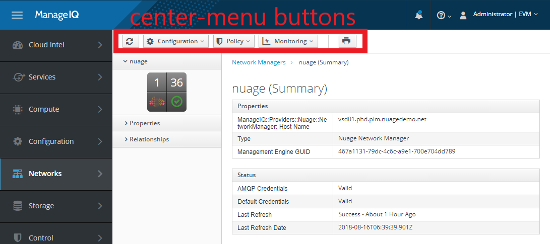
It's now possible to customize center-menu buttons from within the provider codebase.
the possibility to implement arbitrary custom HTML form by means of React Components, also in provider codebase.
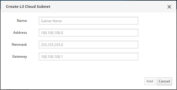
It's now possible to define arbitrary modal window form from within the provider codebase.
Below we first demonstrate how to add a custom center-menu button clicking on which opens a modal dialog containing our custom form. Then we describe how such custom dialog is implemented.
Overriding Center Menu Buttons
This can be done, for example, by creating the following file in manageiq-providers-nuage codebase:
# app/helpers/manageiq/providers/nuage/toolbar_overrides/network_router_center.rb

module ManageIQ::Providers::Nuage::ToolbarOverrides::NetworkRouterCenter
  button_group(
    'nuage_network_router',
    [
      select(
        :nuage_network_router,
        'fa fa-cog fa-lg',
        t = N_('Edit'),
        t,
        :items => [
          #################################################################
          button(
            :nuage_create_cloud_subnet,
            'pficon pficon-add-circle-o fa-lg',
            t = N_('Create L3 Cloud Subnet'),
            t,
            :data  => {'function'      => 'sendDataWithRx',
                       'function-data' => {
                         :controller     => 'provider_dialogs',
                         :button         => :nuage_create_cloud_subnet,
                         :modal_title    => N_('Create L3 Cloud Subnet'),
                         :component_name => 'CreateNuageCloudSubnetForm'}.to_json},
            :klass => ApplicationHelper::Button::ButtonWithoutRbacCheck
          ),
          #################################################################
        ]
      )
    ]
  )
end
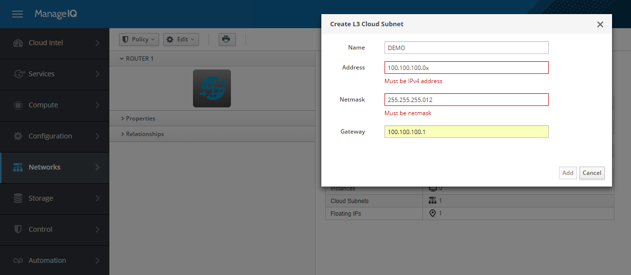
We add a new Edit button group to the router’s details page with the Create L3 Cloud Subnet option, as can be seen on the screenshot below. The button will only appear on the NetworkRouter details page if the router belongs to the Nuage provider. For other providers’ routers, the button will not be there.
Clicking on the button results in the React Component being rendered in a modal dialog.
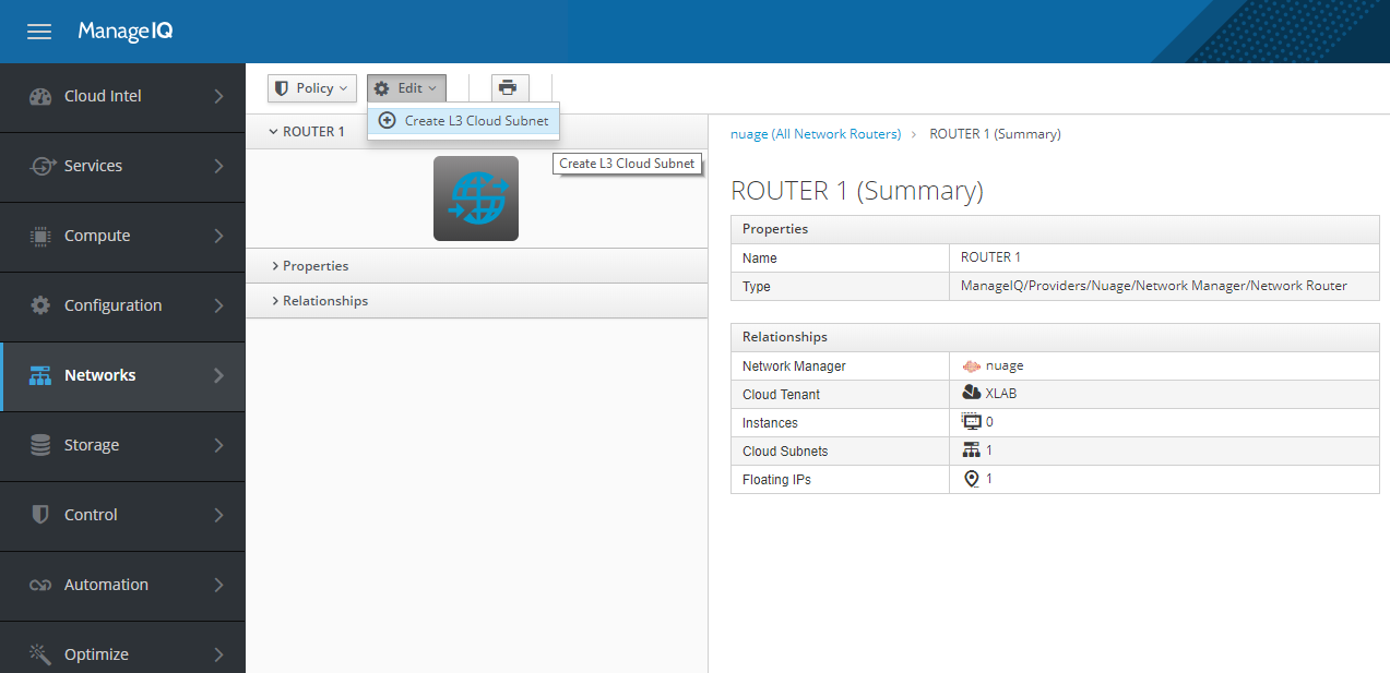
Provider-defined center-menu button 'Create L3 Cloud Subnet'
Quickly About React Component
React is a JavaScript library designed to build websites from components -
React Components. One can imagine a React Component as a <div> element with
corresponding CSS and JavaScript that make it pretty and dynamic. One of the
great features of React Components is the one-way isolation - one component can only
modify it’s child components but never the parent.
As you’ve probably guessed, ManageIQ uses React Components for provider forms. One provider form corresponds to one React Component (which can be composed of multiple smaller Components). When a user clicks on the center-menu button, a modal dialog is opened rendering nothing but a single React Component - the provider form.
There is a nasty problem with such an approach: since modal dialog i.e. parent Component
already displays the Add and Cancel buttons, the provider Component cannot assign
callbacks to them due to the one-way-isolation feature of React. And that’s where
Redux
comes in. Using the Redux’s dispatch method upon mounting the provider Component,
ManageIQ is able to pass Add and Cancel callbacks defined in the provider
Component to the parent modal dialog.
Providing Your Own React Component
To support the Create Subnet operation for Nuage, we basically provided the following React Component:
// app/javascript/components/create-nuage-cloud-subnet-form.jsx

class CreateNuageCloudSubnetForm extends Component {
  componentDidMount() {
    this.props.dispatch({
      type: 'FormButtons.init',
      payload: {
        newRecord: true,
        pristine: true,
        addClicked: () => {
          createSubnet(this.state.values, this.emsId, this.routerRef);
        }
      },
    });
  }

  handleFormStateUpdate(formState) {
    this.props.dispatch({
      type: 'FormButtons.saveable',
      payload: formState.valid,
    });
    this.props.dispatch({
      type: 'FormButtons.pristine',
      payload: formState.pristine,
    });
    this.setState({ values: formState.values });
  }

  render() {
    return (
      <NuageCloudSubnetForm
        updateFormState={this.handleFormStateUpdate}
      />
    );
  }
}
There are two functions needed - componentDidMount and handleFormStateUpdate -
in order to enable reverse communication with the parent modal dialog, as discussed
before. Most probably you’ll just want to copy-paste the two, unless you need some
additional workload being done when component mounts or updates.
Then in the render function we just refer to the real Component that
actually displays the form:
// app/javascript/components/nuage-cloud-subnet-form.jsx

class NuageCloudSubnetForm extends Component {
  render() {
    return (
      <Form
        onSubmit={onSave}
        render={({ handleSubmit }) => (
          <PfForm horizontal>
            <FormSpy onChange={state => updateFormState(...)} />
            <Grid fluid>
              <Row>
                <Col xs={12}>
                  <Field
                    name="name"
                    component={FinalFormField}
                    label="Name"
                    placeholder="Subnet Name"
                    validate={required({ msg: 'Name is required' })}
                  />
                </Col>
                <Col xs={12}>
                  <Field
                    name="address"
                    component={FinalFormField}
                    label="Address"
                    placeholder="100.100.100.0"
                    validate={ip4Validator()}
                  />
                </Col>
                <Col xs={12}>
                  <Field
                    name="netmask"
                    component={FinalFormField}
                    label="Netmask"
                    placeholder="255.255.255.0"
                    validate={netmaskValidator()}
                  />
                </Col>
                <Col xs={12}>
                  <Field
                    name="gateway"
                    component={FinalFormField}
                    label="Gateway"
                    placeholder="100.100.100.1"
                    validate={ip4Validator()}
                  />
                </Col>
                <hr />
              </Row>
            </Grid>
          </PfForm>
        )}
      />
    );
  }
}
Notice how we have full control over HTML and JavaScript as well as CSS. And it is not being shared with any provider! Check the result below.
Provider-defined React Component
Summary
Now imagine combining all this with the power of Ansible operations we introduced in our previous blog post . All of the sudden, implementing the provider and customising it becomes as flexible as it can get.
If your hands are not shaking yet because of all the power that you are given with React Components, you probably haven’t had the chance to ever experience the centralization issue that we discussed earlier :)
Being able to provide both a center-menu button to render Component as well as define any Component you want opens many new possibilities that we could only dream about before. For example, connecting Network Port to a Security Group. One can simply create a button Connect to Security Group on Network Port details page and render a drop-down with Component to list all Security Groups available (didn’t mention earlier, but the entire ManageIQ API is available from your Component). It’s that good!
Contact Us
Need support integrating your provider with ManageIQ/CloudForms? Get in touch with us and we’ll be happy to help you out. Just drop an email to our Steampunk team steampunk@xlab.si or visit us at steampunk.si . Additionally, you can ping us on Twitter or leave a comment on Reddit .

